AI Tutorial
Turn Raw Data into Visual Insights with NotebookLM
Learn how to use NotebookLM to transform raw data into professional infographics and slide decks. A simple step-by-step guide for marketers, students, and teams.
Share
This guide shows you how to transform campaign data or complex information into polished infographics and presentation slides using NotebookLM. The goal is to help you focus on analysis and ideas instead of spending time on formatting.
Overview
Learn how to convert raw data into visually engaging materials like infographics and slide decks. Whether you're working with marketing data or studying detailed topics, this approach simplifies communication and presentation.
Who can benefit?
- Marketing professionals running A/B tests or performance campaigns
- Consultants sharing insights with clients or leadership
- Sales teams explaining results to stakeholders
- Students, teachers, and independent learners tackling complex subjects
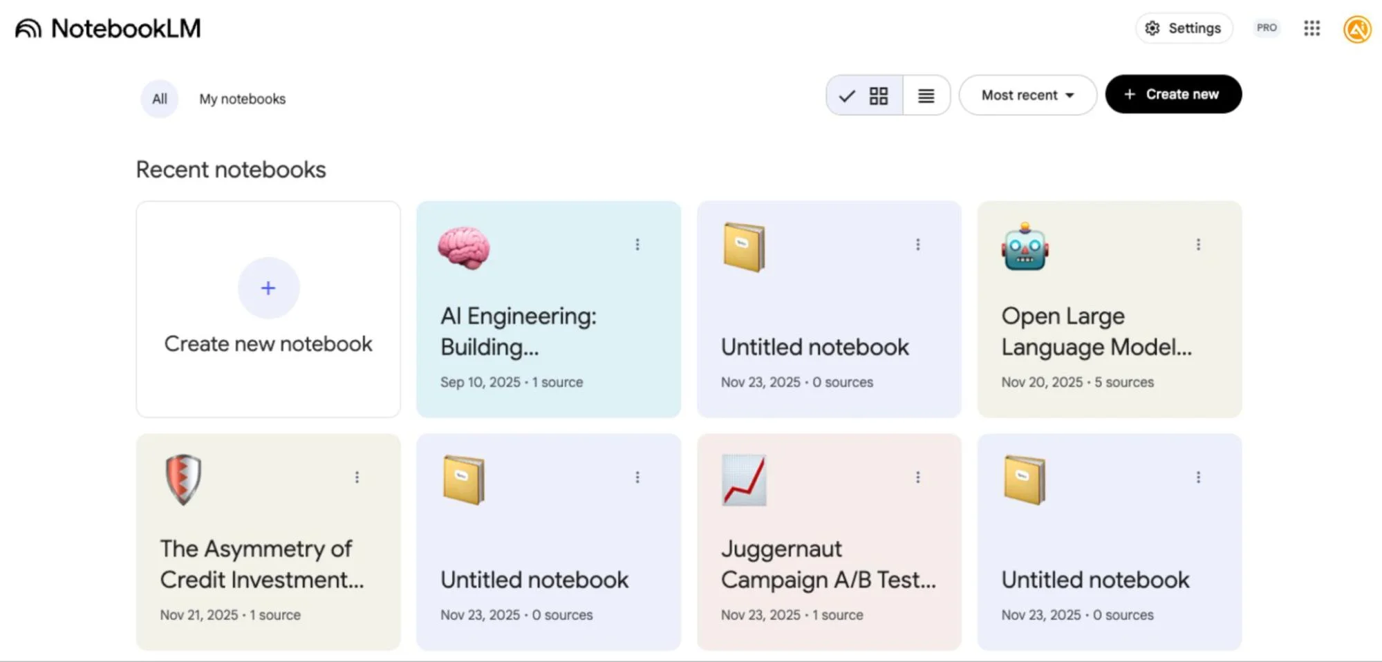
Step 1: Set up your notebook
Start by opening NotebookLM and creating a new notebook.
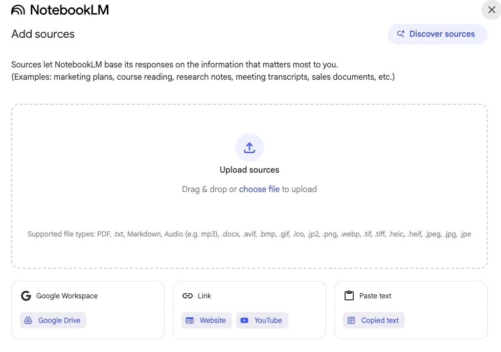
Next, add your data sources. You can:
- Link your Google Drive files
- Add a website URL
- Insert a YouTube link
- Paste text directly (useful for raw data or notes)
You can include multiple sources in one notebook, making it easy to work with diverse information in one place.
Step 2: Upload and analyze your data
After adding your sources, NotebookLM will automatically process and summarize the content.
For example, if you're comparing two marketing campaigns, you can upload raw A/B testing data for analysis.
On the right-hand panel, you'll find content creation options such as audio, video, quizzes, and more.
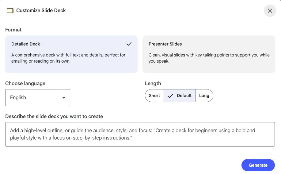
To create an infographic:
- Select layout (e.g., landscape)
- Choose detail level (standard works well for most cases)
- Adjust colors or tone to match your brand if needed
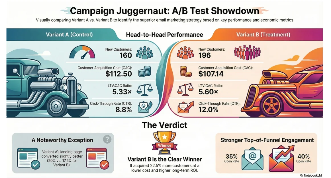
The result will be a clear visual comparison of your data.
To generate a slide deck:
- Select the length (long for detailed analysis)
- Set your preferred language
- Add custom instructions (e.g., highlight the best-performing variant)
Step 3: Review and refine the output
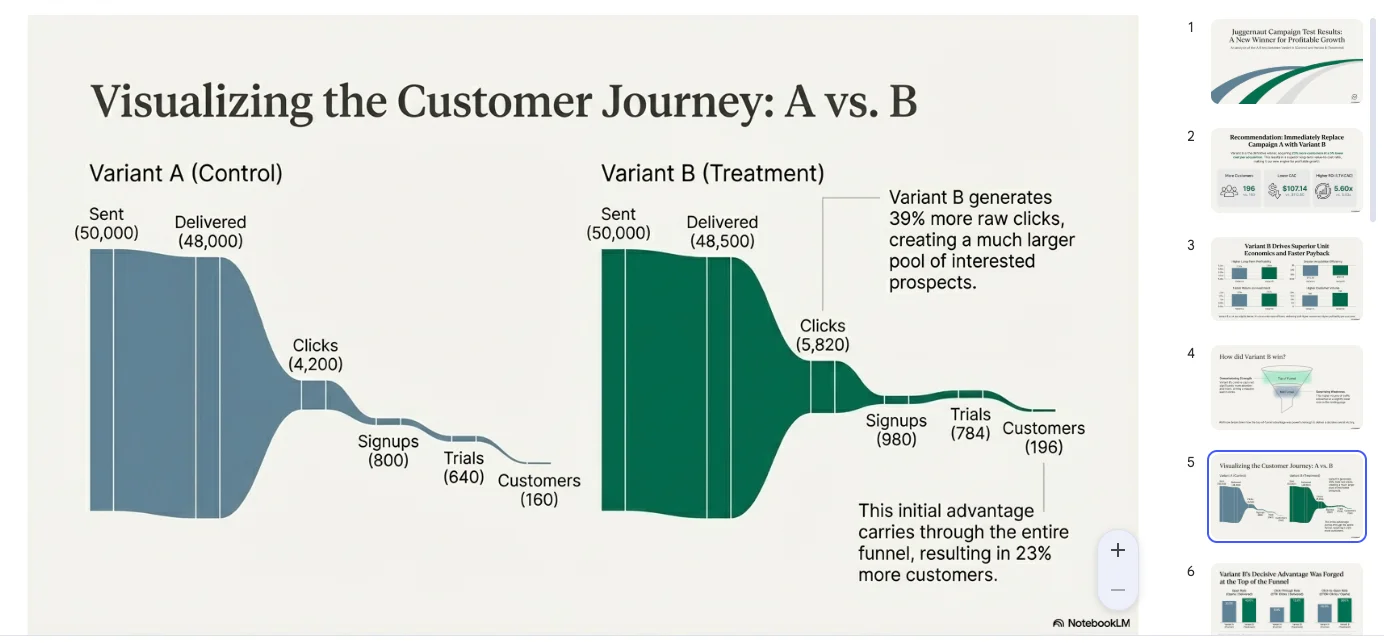
NotebookLM will generate a structured presentation that may include:
- A clear recommendation (e.g., choosing the better-performing campaign variant)
- Charts and graphs illustrating performance across stages
- A visual breakdown of the customer journey
- Supporting data and metrics in an appendix
These presentations are designed to be easy for executives and stakeholders to understand quickly.
Step 4: Share your results
Once you're satisfied with the output:
- Download the materials
- Share them with your team or stakeholders
- Use presentation mode to present directly
Pro Tip
You can apply this same method to learning. Upload study materials such as articles, book excerpts, academic papers, or video transcripts. Then create infographics and slides to better understand and teach the content.
Teaching what you’ve learned is one of the most effective ways to retain information, and these visuals make that process much easier.
Editorial Staff
The Editorial Staff at AIChief is a team of Professional Content writers with extensive experience in the field of AI and Marketing. AIChief was Founded in 2025, AIChief has quickly grown to become the largest free AI resource hub in the industry. Stay connected with them on Facebook, Instagram and X for the latest updates.