AI Tutorial
How to Turn Any CSV File Into an Excel Dashboard Using Claude
Learn how to transform raw CSV data into a clean Excel dashboard using Claude. Follow 4 simple prompts to automate analysis, formatting, and visualization.
Share
This guide walks you through using Claude inside Excel to transform messy CSV data into a clean, visual dashboard. By following four structured prompts, you can automate data cleaning, organization, and visualization without manual spreadsheet work.
Who This Is For
- Analysts and operations professionals who spend significant time preparing datasets
- Founders or managers who receive CSV exports but aren’t comfortable working in Excel
- Students and researchers dealing with unstructured or inconsistent datasets
What You’ll Build
A complete Excel dashboard that includes:
- Cleaned and structured data tables
- Highlighted metrics using conditional formatting
- Visual charts that summarize key insights
You’ll also walk away with four reusable prompts that can be applied to any dataset.
What You Need
- Microsoft 365 with Excel (desktop, web, or Mac)
- Access to Claude through an eligible plan (for the Excel integration)
- A CSV file (your own data or any publicly available dataset)
Step 1: Install Claude and Load Your Data
Start by installing the Claude add-in in Excel:
- Go to the Add-ins section in the ribbon
- Search for Claude and install it
- Log in through the add-in panel
Next, open your CSV file. If it appears as a plain text-style sheet, save it as an Excel workbook (.xlsx).
Tip:
Always create a backup copy or duplicate your data into another sheet before proceeding. Claude can edit cells directly, so it’s best to have a fallback version.
Step 2: Analyze the Dataset
Paste the following prompt into Claude:
Review all the data in this workbook. Explain what the dataset represents, describe each column, and identify any structural or formatting issues. List all problems clearly.
Claude will scan the entire dataset and return a clear explanation of:
- What the data represents
- The purpose of each column
- Any inconsistencies or formatting issues
This step is critical because it ensures Claude fully understands the dataset before making changes.
If Claude asks clarifying questions (such as about abbreviations or formats), answer them briefly. Even small clarifications can significantly improve the results.
Step 3: Clean and Organize the Data
Next, use the second prompt:
Resolve all identified issues. Remove unnecessary rows or metadata. Format numbers clearly for readability. Create structured tables with proper headers and sort the data by the most relevant metric.
Claude will:
- Remove unnecessary or irrelevant rows
- Standardize number formatting (e.g., converting large numbers into readable formats)
- Create properly labeled tables
- Sort data based on importance
This process may take a minute or two, depending on the dataset size.
You can observe changes happening in real time. If Claude suggests a change you don’t agree with, you can instruct it to skip that specific adjustment.
Tip:
Enable session logging in Claude’s settings. This records every modification in a separate sheet, making it easier to track or reverse changes.
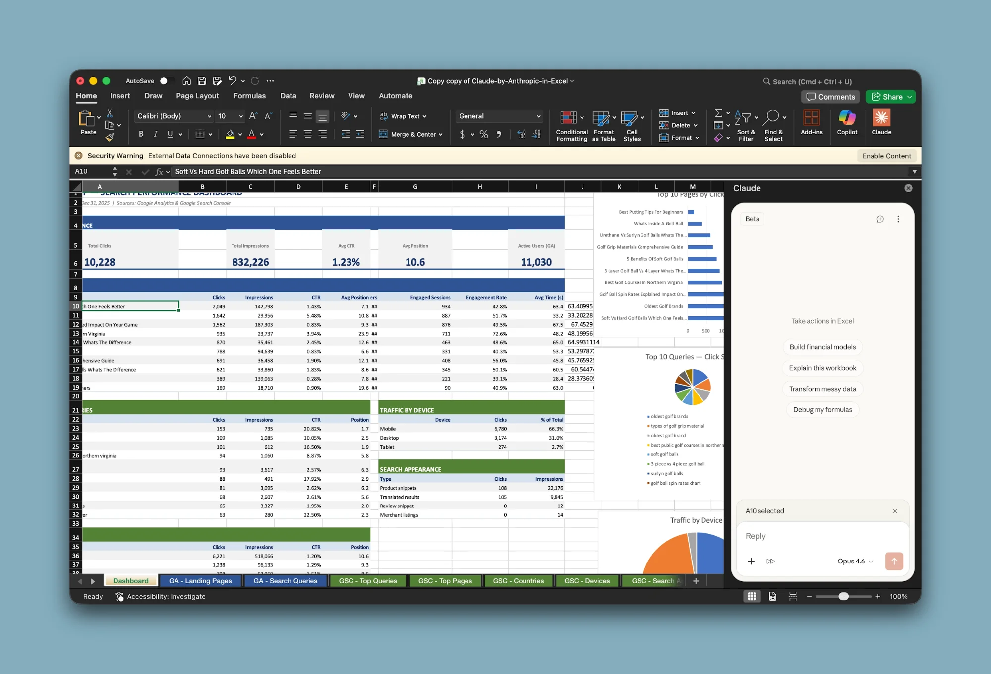
Step 4: Build the Dashboard
Now, paste the third prompt:
Create a new sheet named "Dashboard." Identify the most important metrics and build summary tables for each. Rank entries and apply conditional formatting to highlight top and bottom performers.
Claude will:
- Create a new dashboard sheet
- Select key metrics automatically
- Build summary tables
- Apply visual highlights to important values
Occasionally, some dashboard elements may appear in the wrong sheet. If that happens, simply ask Claude to move them to the correct tab.
This step typically takes several minutes and can run in the background.
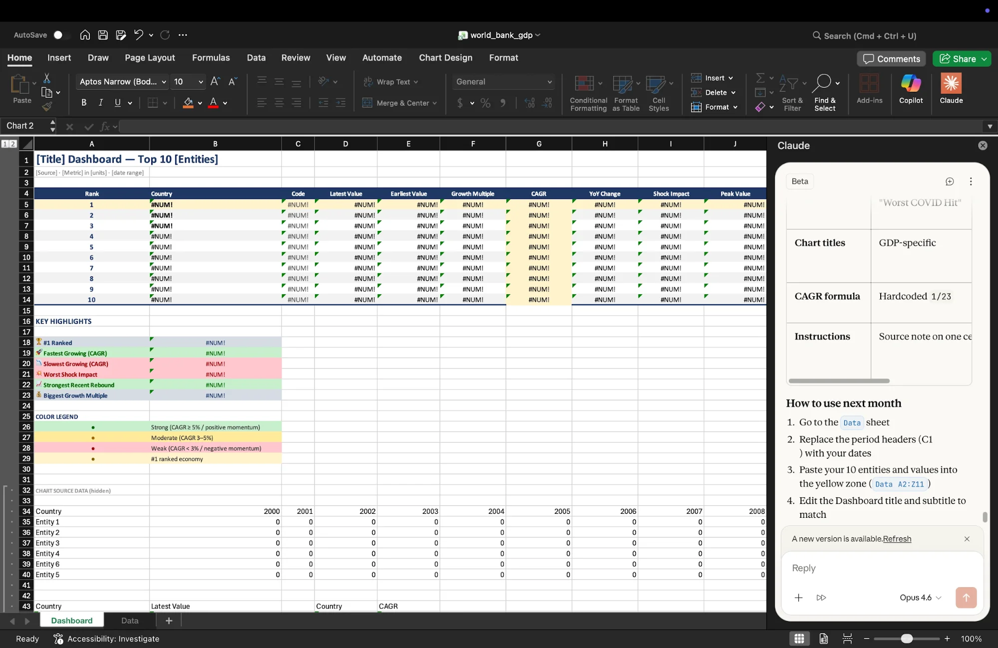
Step 5: Add Visual Charts
Finally, use the fourth prompt:
Add 2–3 charts to the Dashboard sheet that best represent the data. Choose appropriate chart types and ensure they are clearly labeled and easy to read.
Claude will generate charts based on the dataset, selecting formats such as:
- Bar charts for comparisons
- Line charts for trends
- Scatter plots for relationships
Since chart generation is still evolving, you may occasionally need to adjust the layout or resize visuals manually.
If charts appear blank, check whether underlying rows are hidden and unhide them if needed.
Tip:
To reuse this setup regularly, add one final instruction:
Convert this dashboard into a reusable template with placeholder data so I can use it again with new datasets.
This allows you to build a repeatable reporting system.
Advanced Ideas
Once you’re comfortable with this workflow, you can extend it further:
- Use your own business data from CRM, finance, or marketing tools
- Create standardized dashboards for recurring reports
- Build reusable templates for your team to use consistently
Final Thoughts
This process eliminates the most time-consuming parts of working with data. Instead of manually cleaning and formatting spreadsheets, you can rely on Claude to handle the heavy lifting and focus on interpreting insights.
Editorial Staff
The Editorial Staff at AIChief is a team of Professional Content writers with extensive experience in the field of AI and Marketing. AIChief was Founded in 2025, AIChief has quickly grown to become the largest free AI resource hub in the industry. Stay connected with them on Facebook, Instagram and X for the latest updates.